
Ferm Living– Based in Copenhagen but working with artist makers worldwide creating collections of furniture, lighting and accessories. They describe their aesthetic as ‘ avant-guarde shapes and striking details.
I found some of their work mimicked the concept of ‘minerals’. How paring down simple shapes and repeating them are an effective way to translate a ‘vibe’

Tom Pigeon – A Scottish based husband and wife duo who set up a design studio to design and create the sort of products ‘they themselves would like to win and live with”.
Some of their prints are incredibly simple. Again a testament to the power of shape, colour and composition.

Slowdown Studio – I love the whole concept here. Based in L.A, but collaborating with artists worldwide. The aim is to promote beautiful and functional works of art. I have always been interested in this combination. So much so that I have felt my own conflict between a Fine Art and Applied Art route. This way of working with artists, who could be painters, illustrators and/or designers allows for these to worlds to collide.
They even run a Slowdown Art Competition once a year, with finalists winning having their designs on the woven blankets.
Looking at the artwork, much of the aesthetic here is based on bold compositions and use of colour. Some are abstract whilst others have more of a narrative to them. Often humorous and bright.

One of my favourites is British surface pattern designer Tom Abbiss-Smith:

Reiko Sudo
Founded NUNO in 1984 and known for pushing the boundaries in Textiles. I first discovered her when looking at yarn designs. Eventually led me to buying the book “Structure and Surface: Contemporary Japanese Textiles” by Mathilda McQuaid, 1999.
Her work combines using the master traditions against cutting edge new technologies. Her whole approach is inspiring since she recognises that all work, even failures, can inspire and/or create new work.
The two examples below I feel could connect to my investigations in to copper/metallic/shine.
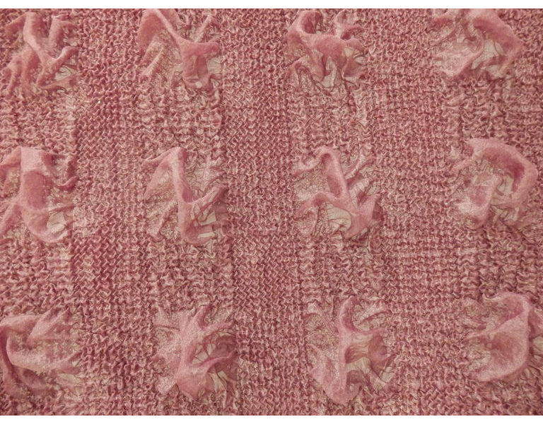
The materials appear to have a fragile quality to them and have yet been through a process of heat in “Jellyfish” and the use of copper – the very same used in telephone wires to weave the second “Copper Cloth”.
I wonder if I could experiment with copper thread, to create a similar look.
A complete antithesis to the above more commercial based design, is an artist who I have been following on Instagram; Willemien de Villiers.
Her work come from a fine art concept background. I was initially drawn to her on an aesthetic level, I found (surprisingly to me) that some of my personal colour palette in my work seemed to be use a lot of pink tones. I have wondered about this ‘unconscious’ decision, which is where I have looked more deeply into de Villiers’ work. She tags much of her work under “feminist art”, “subversive stitch” and “pink art”.

I find the compositions and layering, and texture and marks made through stitch have depth. As I have worked through the projects, I have pondered more and more on the reason behind my choices. Be it colour, composition, material etc. Although I enjoy the playing and combination of formal elements, finding meaning in the work I am making is just as important to me.
